Good Morning - Revisited
Good Morning - Revisited, A Post Mortem
Introduction
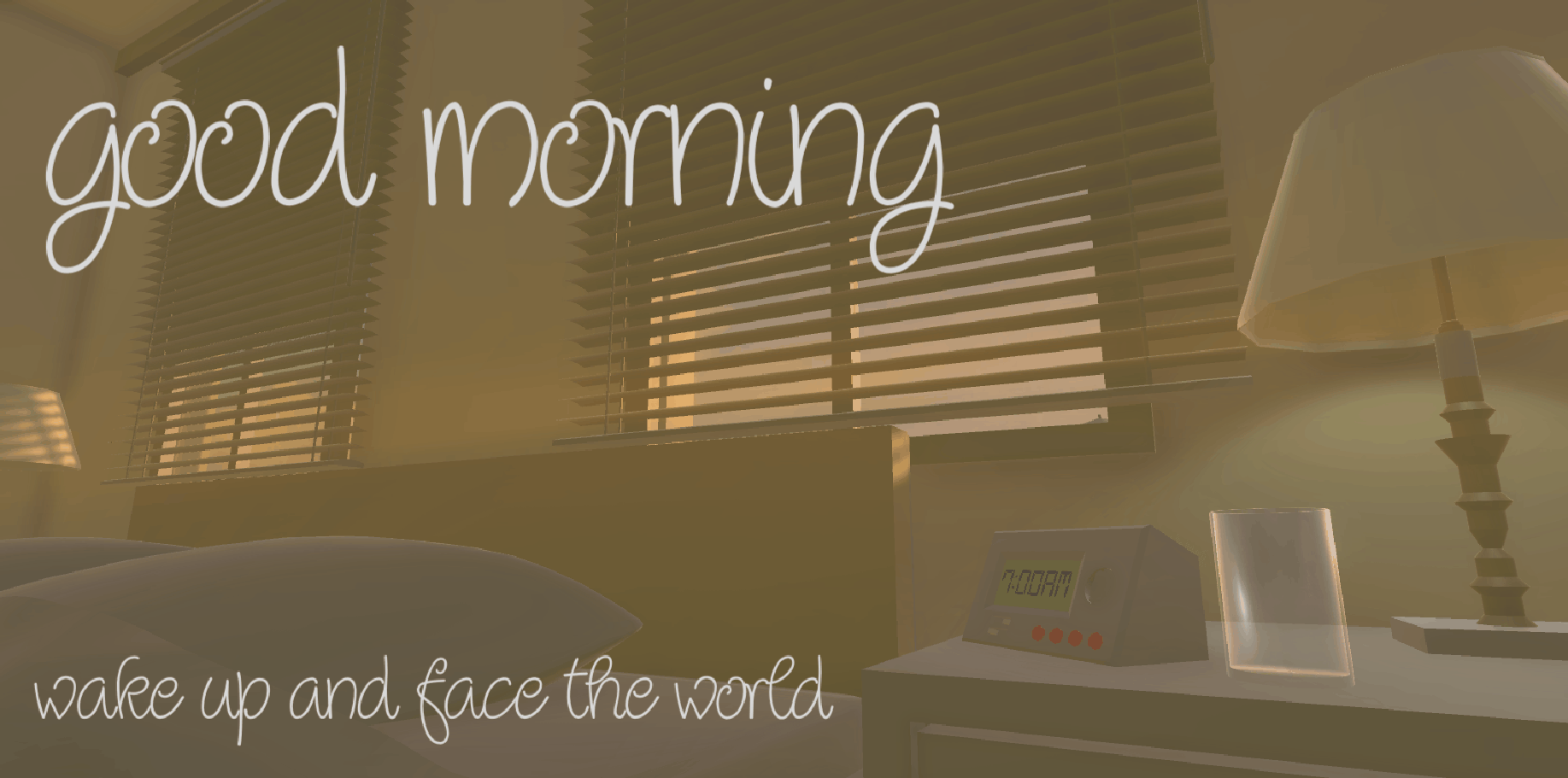
Good Morning - Revisited is a rework of a previous title I had shipped three years ago for a student project. The game’s core feeling was to remind those who played it of ‘home’, which was whatever that meant to them and draw them in using a feeling that would represent that nostalgia or a feeling that still exists for them now. It was a partial success. The feedback we received was very positive in regards to the overall aesthetic of the game and what it felt like to experience a morning routine with that early-morning aesthetic. The only shortage was that a few of the systems were broken and with hastily approaching deadline we didn’t have time to fix them before we showcased the project. So recently I went back and touched the game up, fixing all the issues it previously had and re-designing it in the image we originally intended for it.
What Went Right?
Everything that was kept from the original build.
The area we received the most positive feedback in was the visual aesthetic of the game, which only made sense for us to keep when redeveloping the game. This was because everything we planned mechanically, i.e the missions, already had their places designed for them. I felt that the house already represented that small homely feeling I aimed to achieve and that reshaping it would serve no purpose other than to add more useless space to take up the player’s time and confuse them, which is already what the laundry room did.
The only reason why I kept the laundry room was to suit the flavour of the world as it would be ridiculous for a house to not have a laundry room. Even then I still had to implement some reason for players to use that room so a notepad with morse-code written on it was placed in there. The translation adds no depth to the game and serves no purpose other than to waste the player’s time but it still adds some meaning to a room that would otherwise be confusing. For example, during playtesting a player asked why they couldn’t do their laundry since the room was there. So, the notepad, being bright yellow and appearing as though it’s about to fall off the edge of one of the washing machines, was put there to put their attention away from a mechanic that isn’t there.

New ways to interact with the world.
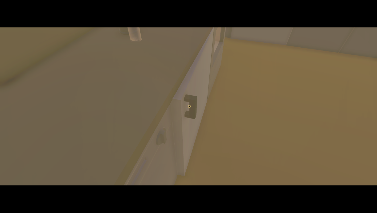
When redesigning the interaction system I thought it was best to remove that abrupt, jarring, and screen-obscuring blue outlines of the objects that were the next stage in a mission and replace them with a much more gentle and tasteful pulsing crosshair that would pulse whenever you are looking at something that can be interacted with. This was much more successful as it allowed us to remove the feeling of linear progression and replace it with a sense of curiosity for the players. With interactive and fully operable doors, cabinets, and pickup-able items there was a plethora of reasons to explore the world instead of running to the nearest blue outline to progress in the mission.
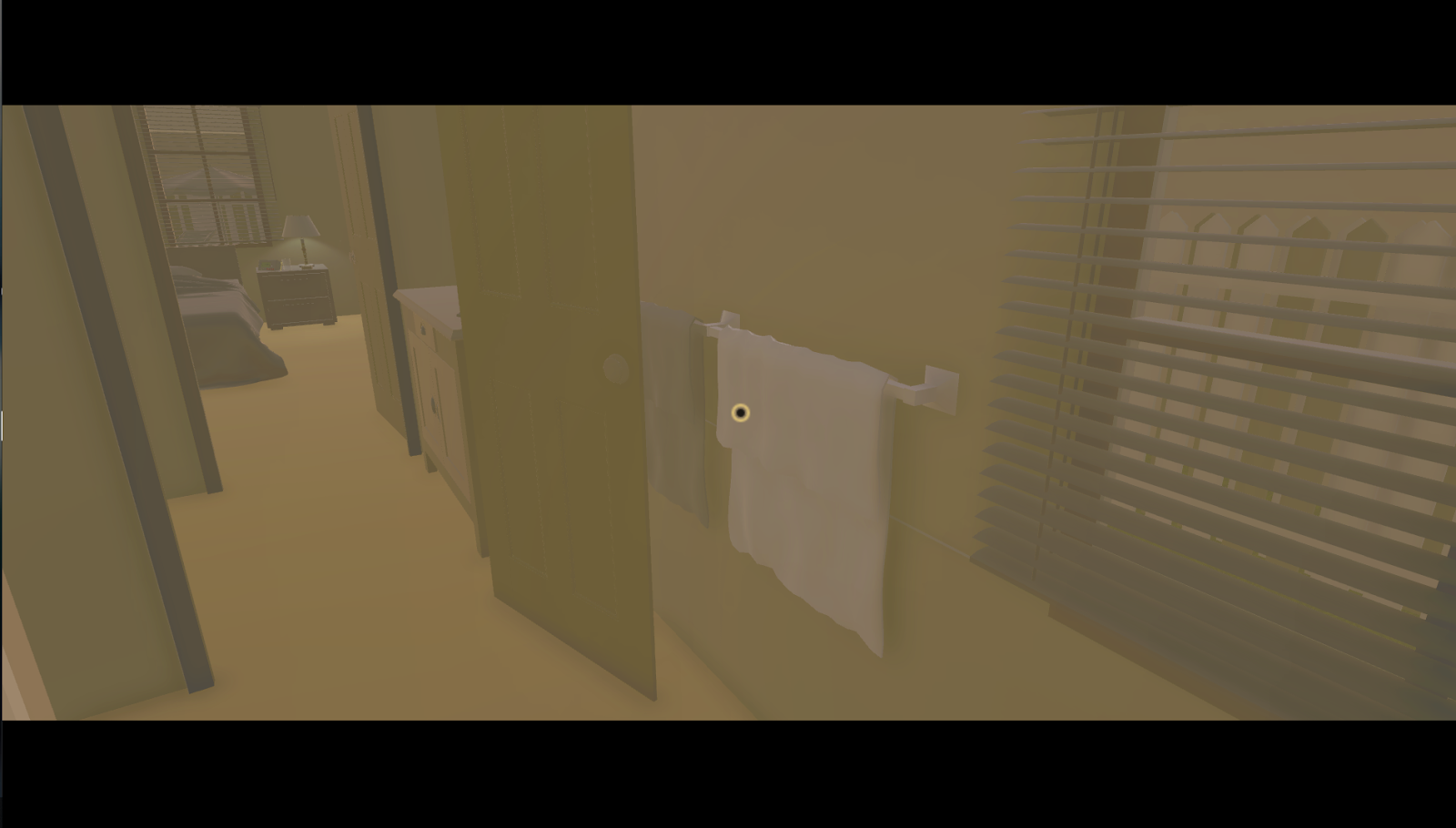
I did this by simply reevaluating what would make the players feel more at home while still making it obvious what could be interacted with and what couldn’t. The crosshair was already stapled to their screen to pinpoint where they were looking so I could minimize the amount of screen-obscuring by making it the point of reference for interactivity. I also chose to make all interactive items a lighter shade grey (except the main three doors, as they are obvious enough to use once the players leave the first room), which the players would eventually pick up on after encountering enough of them. I tried to make this pattern as obvious as I could as no other items in the world are that same shade of grey to avoid confusion.
After thorough playtesting, it became apparent that my design choice was the right decision. There was the odd ‘click everything to see what can be interacted with’ type of players but I assumed that was in an attempt to see if I had fumbled and made something interactive that isn’t light grey. I knew it was the right decision as I observed that in combination with obvious progression, i.e washing your hands after going to the toilet, players began to realise the implied interactivity. This was also reinforced by making the colour stand out obviously, i.e putting the interactive light-grey towel in the foreground while the darker-grey towel would normally be behind the door:
Extra interactivity.
When designing the missions I decided that choosing the linear step-by-step progression from the old build would be a poor choice. This is a game about doing your morning routine how you like it. This meant removing the hand-holding from before and embracing the freedom of choice for our players. I did this by giving players the opportunity to complete any mission in any order while still tracking what they did through the post-game stats screen that showed which missions they did or did not complete.
There is no right or wrong way to play, it simply states what you (your in-game character) felt like when you left the house, which you can do at any time, even immediately after you get out of bed. For example, if you did not eat breakfast when you left the house it would say that you felt hungry, as you would. I also gave our players the freedom of choice by giving them different ways to complete their objectives. As silly as it may be I still wanted choices like putting milk in the bowl before the cereal because it removed that blocker of only completing things one way while also giving them that false sense of breaking the designer’s rules, which is really what I was trying to achieve here. You can deliberately go to the toilet and forget to wash your hands, you can leave the shower running, you can pick up things and drop them in silly places.
All of these things are without literal consequences, but I found that in almost every playtest session I held, players would almost always comment on the state of the house and/or character after they left the home, stating that how awful it was that they left the house with the shower of, or the fridge open, or the milk out. It’s this type of freedom that I believe is what makes the players feel most at home and I was ecstatic that the players cared about the world they were in and the state of their house when they left, which means I achieved my goal of making it feel like their home.
Meaningful, small additions to reinforce the intended feeling.
There were a number of small things that were brought up to us in playtesting that I was able to implement in the final build of the game. The clock being the most notable feature, as a large portion of playtesters would wait and stare at the clock waiting for it to change, only to find out it was static. This ruined their suspension of disbelief and moved their understanding of the world to that of a perpetually frozen time-state that gave them all the freedom in the world to do as they wish without the repercussions of time.
Although a small change, it was one that was worth it, no matter how insignificant the chance the player would go back to look at it. Because once the player has woken up they are immediately under the impression that they have things to do when they leave the house, which brings about a sense of urgency (it’s the tagline of the game to complete the routine before you leave the house so you can get on with your day). The moment the player notices that time has/is stopped then that breaks them away from their reality and gives them all the time with the world, which they do technically have but that’s not the intend feeling I’m trying to achieve here.
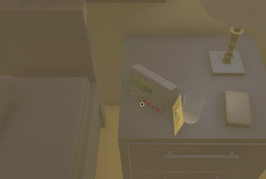
The result of this when playtesters noticed this was insignificant, they simply waited a minute for it to change then passed it off as a ‘that was cool’ moment then never went back to it. While this may seem like it wasn’t worthwhile, this was exactly what I wanted. It’s keeping them grounded in the world and nothing else.
Along the same lines of small additions to reinforce intended meaning, I also added blinking and black bars for letterboxing the player’s screen. This, for us, works as a two-birds-one-stone kind of situation as it not only gave the game a more cinematic appearance to further pull you into the world, it also serves as the in-game character’s eyelids, as when you wake up, you aren’t fully alert and your eyes are half open.
I had hoped that this, in combination with the random blinking effect I implemented, would further reinforce that morning feeling after just waking up by putting them in the shoes of someone who you could see was still physically waking up. The blinking was completely random so there was no way a player could try and wait for it to happen in a pattern, ruining their own suspension of disbelief. It just really happens randomly.
I did this by layering a panel of black bars behind the ‘wake up’ animation that players after the game begins. So when the player gets out of bed it appears as though the eyes just never opened fully, this is, of course, an illusion, as the bars were just behind the other layer of eyelids. Beyond this, there was another separate layer of eyelids again, so each eyelid could move independently and use its own animator controller. This was so that if the animations ever did fail, like the blinking eyelids just opened too far or decided to not move at all, then it wouldn’t be noticeable as the second set of letterboxing eyelids were always there.
This was passed off as just another one of those ‘neat moments’ by the playtesters, something that helped reinforce the early morning feeling subtly as the playtesters soon began to forget it was there at all, just another feature in their peripheral vision that was always there doing its intended job. But, of course, taking it out of the game would have a massive impact as there would be an empty feeling of ‘I’m suddenly wide awake’, which I felt that it would push the players too much into running everywhere, making the game look too open and unsuppressed by the letterboxing.
What Went Wrong?
Fewer ‘missions’ for the morning routine.
Some players prefer tea instead of coffee, some players prefer toast over cereal, some players may want to do their laundry and some may like to check their mail. Couldn’t do these due to the deadline I set myself that I had already exceeded, so I just made the core playable refined.
In the original version of the game, it featured the same four missions that made it to the final build of the revisited version of the game, which is not necessarily a problem. But when planning the features within the scope of the to-be revisited game, there were a variety of additional missions or alternative ways to complete already established missions that I wanted to make the final build. These missions were: making tea instead of coffee, toast instead of cereal, checking the mail, doing the laundry, or even checking the voicemail on the phone.
I failed to estimate how long it would take to develop each mission individually and the systems that worked them, as I continued telling ourselves “Oh, we’ll only need a day to complete this mission, at most!”. I was wrong, as every new feature or system introduced a series of bugs and technical issues that took hours to mend and fix and would eventually bleed into the next day, sponging up days of time - one of the reasons why I went two weeks beyond the deadline. So ultimately this issue was fed from a lack of forward planning, but luckily I worked around this by shortening the scope of the game while still maintaining a feature-complete end product.
Aside from the usual ‘plan better’ fix that almost every project like this would end up needing to do, I used what time I had left to polish the core experience rather than overload it with unrefined and broken content to try and keep up with our original intended feature list. The playtesters much prefer this, although I received a large amount of feedback for possible ‘future content’ to add, which more often than not ended up being the missions I planned to implement anyway. But this was much preferred to feedback regarding just fixing bugs and other problems within the game from poor planning.
Options menu not on the main menu.
One of the most important features that I implemented into this rework was a more expansive and inclusive options menu. In the previous build, I only featured an invert camera axis toggle and that was it. This time I set it as my goal to give the players more variety to suit how they would perceive themselves in our world by implementing, not only the invert camera toggle, but a master volume slider, field of view slider, and separate axis sensitivity sliders.
I achieved this by extending the functionality of the menuHandler script, hoping to ‘future proof’ any problems I might encounter since the options code will be accessible through all scenes since the options menu was shared across the main menu and the in-game pause menu. This, unfortunately, while within my scope, would take too much time with my deadline approaching, as the options refused to synchronize between the two separate options menus.
This resulted in us removing the options from the main menu which lead to another frustrating problem: players couldn’t change volume, axis, or sensitivity outside of the game and with the opening movement of the game blaring an alarm in your ears this could prove annoying, or in the worst case, harmful. So to solve this I went back and turned down the master volume to 60%, nullifying any chance of harm while still remaining annoying, as many playtesters pointed out, as it cannot be changed until the player leaves the bed.
There was also the problems of players turning the sensitivity to maximum and spiralling whimsically out of control whenever they tried to turn. While this is a problem it is something I won’t address as some players legitimately prefer to have sensitivity this high and taking that from them is more problematic than the off chance that someone will not take the game seriously, which is bound to happen regardless. Ultimately, though, whoever does decide to abuse the sensitivity like that would assumably tire of how difficult it would be to progress and change to a sensitivity more comfortable.
Optimisation.
The optimisation of the game was still very much in poor condition, despite many attempts to fix this issue that still remains from the previous version of the game. The main concern is that many players experience low frames per second on lower-end systems even though I have done everything I can to reduce performance. Many players have also experienced a blinding yellow light that engulfs their screen whenever playing on any setting other than the highest, which was fixed for the most part but still remains on certain systems which are not yet known.
I removed all of the colliders on anything the player wouldn’t touch, i.e the roof, above ground cupboards, scenery outside of the house, and anything else that isn’t a table or could have an object placed on it. This helped slightly but not enough to fix the entire problem.
The low frames seem to originate from the visual effects on the camera as playtesters have discovered that looking in any direction that there are sun shafts or advanced lighting effects performance seems to be impacted immensely. This was fixed by simply changing the graphics settings to low. But for a game that consists of a very minimal colour palette and very few objects, it seems abnormal to getting performance this poor.
If would also say that a large contribution to the poor performance is the code that the interaction system was based off. I built it using one raycast to check for each individual interactable item in the one raycast ‘if’ statement with many more nested ‘if’s that check for different interactions all at once. This is obviously a poor optimisation choice and I only discovered an alternative, performance-superior method about a week from the deadline, which I didn’t have time to re-script. This is not very noticeable as the poor performance doesn’t come from interacting with objects, but to object to it having anything to do with the poor performance would still be out of the question.
Ultimately the cause of the poor performance is still unknown, but given the opportunity and time, I would like to go back and mend this issue as it is one of substantial magnitude that can’t be pushed aside like other, smaller issues like the animation system with cabinets and doors not closing all the way. The yellow-screen bug seems to be repaired, though, which means that if some players cannot play on the highest settings then the silver-lining is that they can at least play on lower settings, which is still not an acceptable solution, but the only one we have right now.
Doors not closing all the way.
This is a strange problem I never found the solution to. Any animation I had where something would open or close would mostly always remain partially open upon closing it. I checked through the animations, extended the coroutine timers hoping that the animations were just not given enough time to play completely, and I even extended the animations themselves thinking that there was a bug cutting them short (which was actually a fix for the end-game cutscene ending abruptly), but alas this was to no avail.
Obviously, this type of issue is rather obvious and people picked up on it immediately, frustrated that they couldn’t close the kitchen cupboard or fridge all the way which left their virtual milk go sour. This also left the playermodel’s colliders partially protruding, allowing the playermodel to catch on the outcropping doors and cause more needless frustration. Beyond this there were no other real reasons as to why this is necessarily a bad thing, it just interferes with the flavour of the house and the player’s need to ensure that their own house can actually be operated as a real house.
This, though, fortunately, has had the unintended feature of showing the players which doors and cabinets they had opened before, showing them where they have and haven’t been. In my eyes, this is a true unintended feature as it gives players a frustratingly noticeable marking for which doors they have opened, regardless of whether they think it is a good or a bad thing because it still achieves its unintended goal. While it may be nice to keep this, it is something that I would like to change in the future given the chance.
Sound SFX.
Most of the interactions in Good Morning - Revisited don’t have sound effects to represent them and since hearing is one of only two senses that videogames can use, it means players are missing out on half the world’s interactivity, leaving sight as the dominant one. Obviously, visuals and sounds are two different disciplines and require two different sets of skills, but it doesn’t mean that only one can be used without the other when working on a solo project.
Our original solution to this problem when there were four of us working on the original game was to source all our sounds from ‘freesound.org’, a brilliant website that has thousands of sounds you can use for projects like this. Many of the original sounds made it into the final cut of the ‘revisited’ version of the game, but depending on how much I had to change the mission they were allocated to, it meant that some didn’t make it in the end. For example: the cereal and coffee missions both are predominantly silent bar the coffee machine, which wasn’t interfered with at all except for changing its name to something more specific and easier to remember, which was done so that the raycast could find it using GameObject.Find.
The missions were silent because I had to completely re-do the pick-up system to something more open-ended, which ended up giving the player the ability to pick up and drop any object at will, which allowed the completion of any mission in any order. This was unlike the older version where missions had to be completed in a certain order and each mission had its own mission-specific objects, like a separate box of milk for cereal and coffee. So, in the end, I would have had to find all the sounds again in our sounds folder, which isn’t as bad as it sounds until I realised that their naming conventions were random gibberish that was given to them by their original creators when uploaded to ‘freesounds.org’.
This is our fault for not renaming them in the first place but putting that on top of the already mountainous workload would not be a wise idea for me, so they were left soundless, which had a poor reception from the playtesters which were left wondering why the shower and toilet missions had sound but not the coffee and cereal mission.
Footsteps.
Footstep sounds are something that was in the older version of the game, though only exhibiting the sound of shoes on wood, which was lost when I removed Unity’s standard character controller and built my own so that it could serve other needs that couldn’t be satisfied with just Unity’s standard controller, like talking to other scripts that need to gather data from the character controller or vice versa. So in the revisited version of the game, there were no walking sounds whatsoever, which should obviously reflect what kind of surface you are walking on, what kind of shoes you’re wearing, and how fast you are walking.
This was due to a restriction on the number of sounds I could make and/or find. I could have added footstep sounds but it would be a static sound no matter where the player would be walking unless I had an individual sound for each surface the player could traverse on, which would be far out of the range of the project’s scope considering there are the possibilities of: walking barefoot on carpet, walking barefoot on tiles, walking barefoot on wood, walking barefoot wet on all the aforementioned surfaces, walking on the aforementioned surfaces with shoes on, walking on those surfaces while wearing soaked shoes if the player got dressed before showering.
This would have distracted the players from the intended experience and given them something meaningless and trivial to spend time testing, resulting in a sour experience from the players because something in the game didn’t make sense and they spent time figuring it out. Removing it destroys any chance of that happening but it also takes away a large portion of the audio the players would hear.
I could have simplified the whole system and just given barefoot and shod sounds, regardless of surface or condition. This would have suppressed the flak had players tried to experience with surfaces while still giving them the audible progression of walking they are seeking. This thought has only occurred after reflecting on the project after development, proving that given enough time a workaround for this issue would still be viable.
Conclusion
To conclude, I truly think this project went well and I am overwhelmingly happy with the end result. Even though the optimisations were poor and some of my methods for developing the systems were very janky, it all worked out mostly smoothly in the end. The entire core playable was there with all the features that it needed to work, even if some were cut. At least that meant that I chose the right decision in polishing what I had rather than pushing for more features. Given more time I would happily go back to mend the few issues that I left it with or even develop more content for it, but for now, this is a project I can truly leave alone and feel like I have delivered a complete experience.
Leave a comment
Log in with itch.io to leave a comment.